Designing an Accurate First Impression
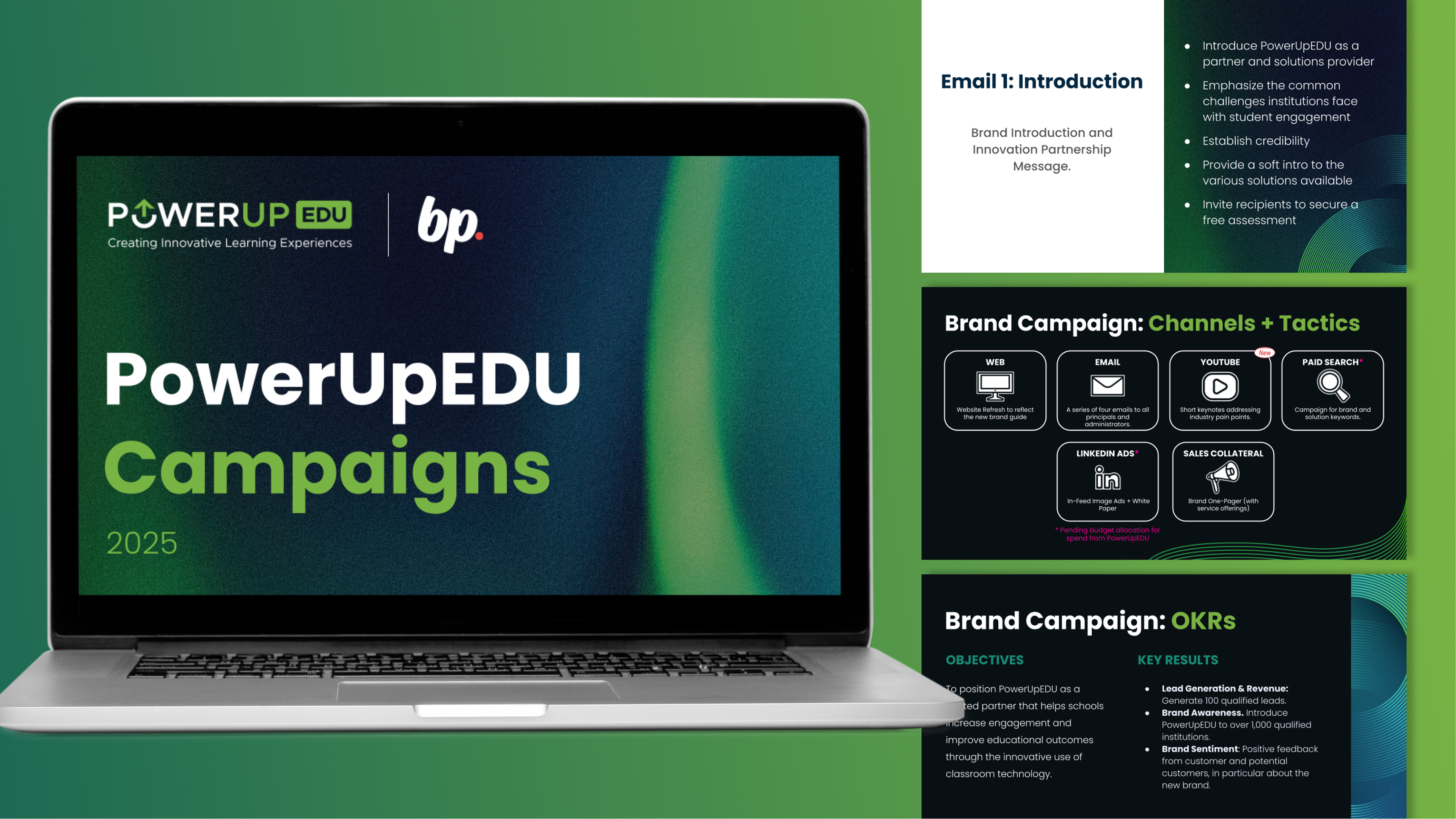
PowerUpEDU needed to guarantee that client touch points reflected their trustworthiness, credibility, and solutions in technology. However, their visual identity was outdated, misrepresenting the company's values and advancements. I refreshed their logo in a way that would still be familiar to their audience base, and provided a design system that emphasizes their continuous innovation. This branding has been applied to integrated campaigns and their website.

Logo directions needed to resemble their previous branding, which included green "EDU" and a power symbol.

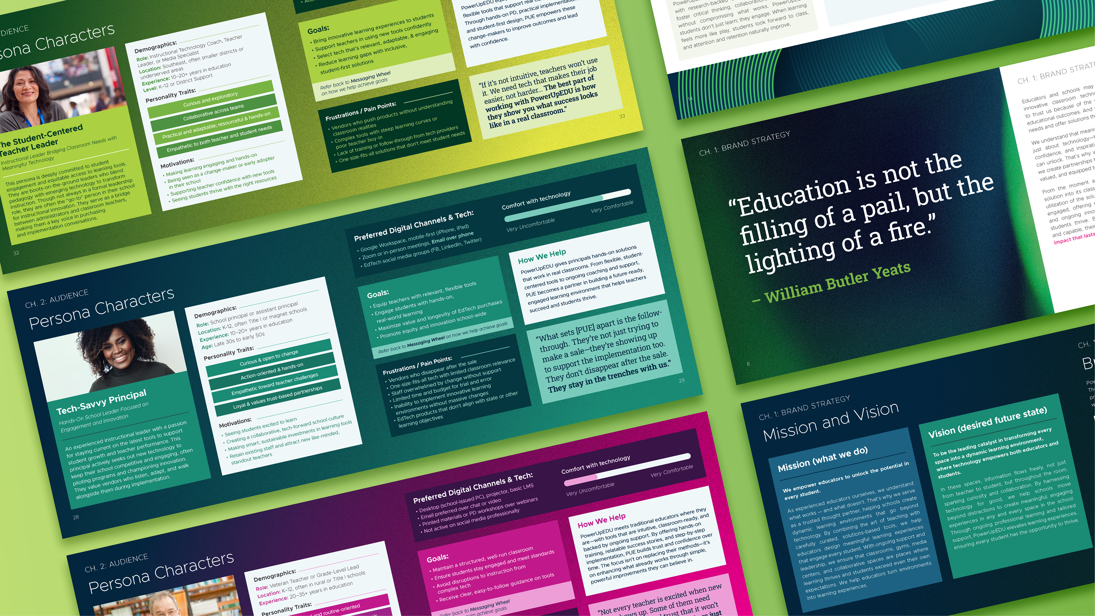
Designed brand guide with graphic patterns and illustrations.
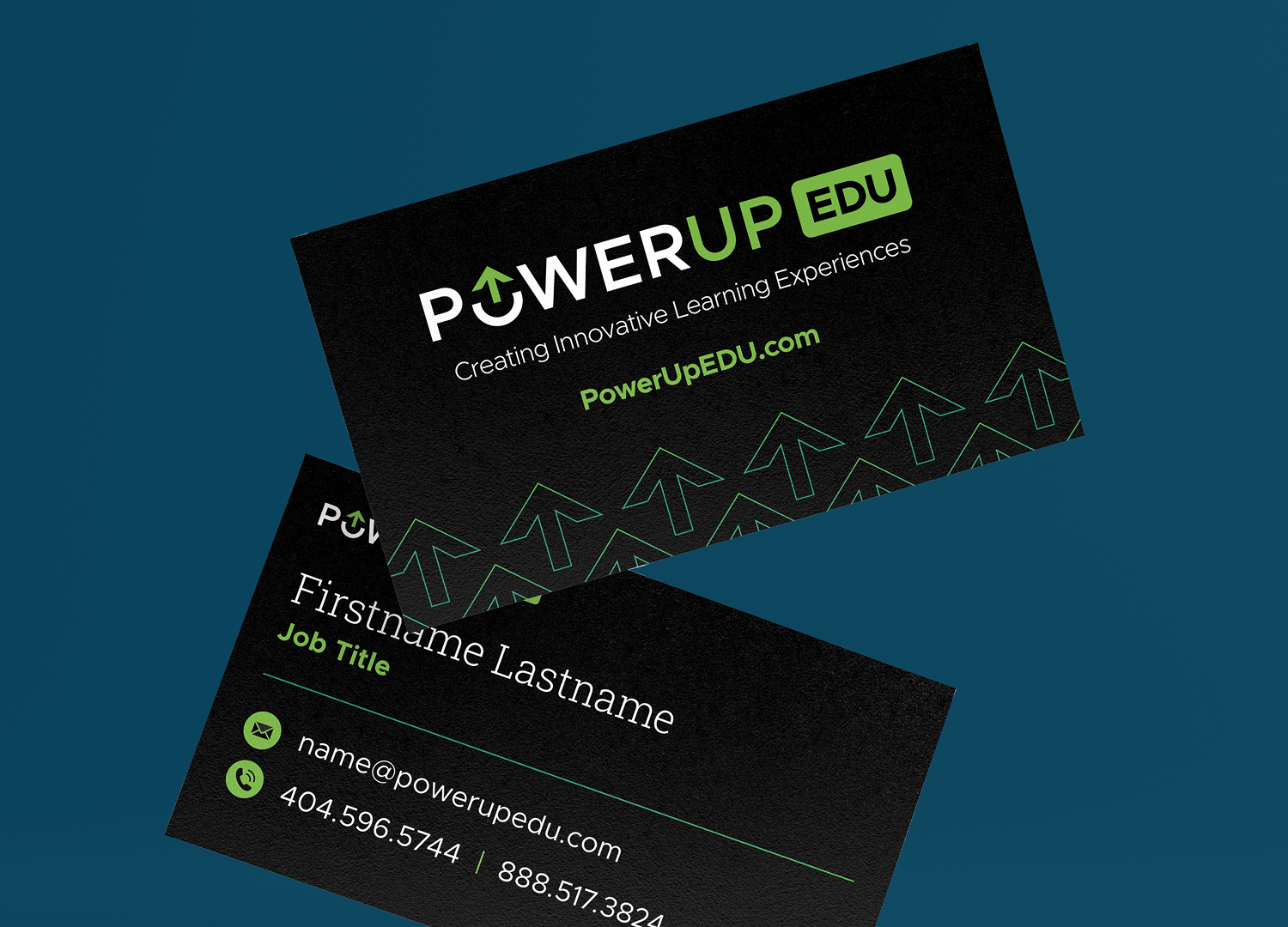
Redesigned marketing collateral and sale assets.
Brand Applications
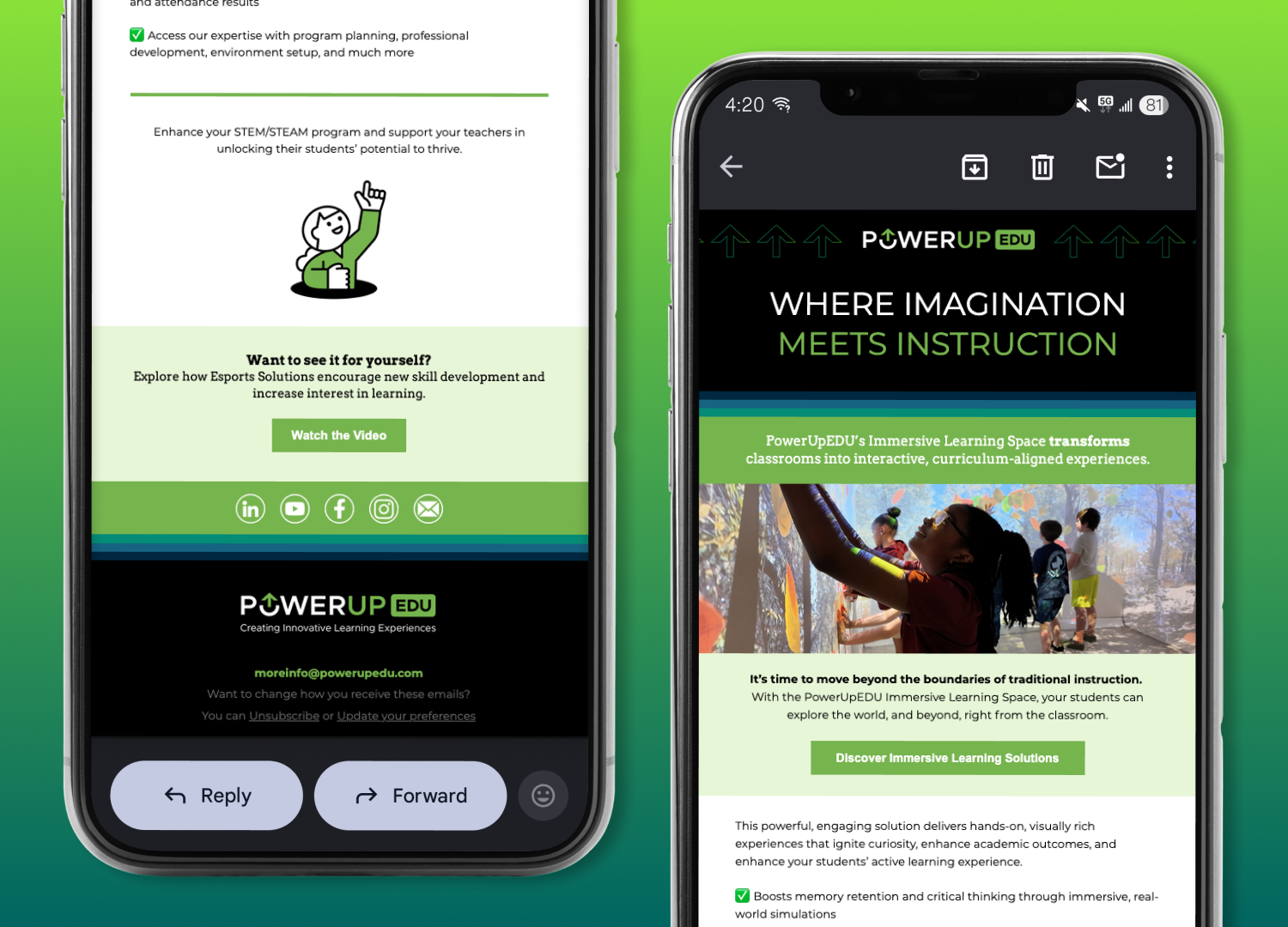
I implemented PowerUpEDU's new visual identity to their most needed sales assets, both print and digital.
Designed slide decks and templates for internal usage.

Designed website assets, such as headers and social media covers.